What is Illusion?
Illusion is an opinionated, mobile-first, progressive enhanced, accessible, SCSS base kit to kickstart your projects. It combines modern web-design philosophies to write consistent, maintainable and clean SCSS code in less time.
Illusion is built to be used on top of Modernizr and Normalize. When included, Illusion does nothing. Enable its base styling features by setting SCSS variables or use the mixins or functions library.

Why Illusion?
We found ourselves copy-pasting code from project to project even though we already use several libraries. Our solution? We’ve created our own library!
Opinionated
Illusion is very opinionated. We believe in certain values and philosophies. Illusion could be very useful to you if you share the same ideas:
- Mobile first philosophy and design
- Progressive enhancement
- Accessibility
- Maintainable CSS
- Harmonized design
Not a believer? No hard feelings! Maybe Bootstrap, Foundation or UIkit fits you more.
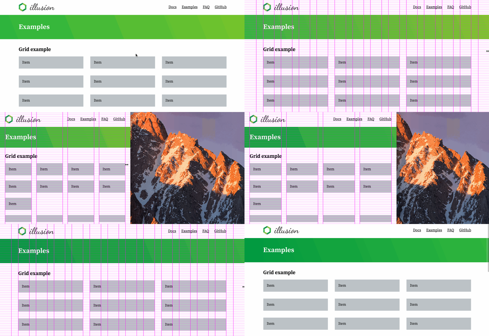
8 pixel responsive grid
One of the most important aspects of a website is the grid it’s based on. It can make a page feel balanced and in harmony when used right, but when used wrong a page may appear untrustworthy.
Illusion uses a grid that:
- Is based on an 8 pixel system
- Has responsive gutters ranging from 16px to 32px (can be overwritten)
- Is using calc() and pixels so vertical gutters follow horizontal ones
- Comes with an optional fallback for the
<body>element to have a set-width
By placing everything on an 8 pixel grid you ensure that your design looks crisp on all screens. Even screens with a 1.5 device pixel ratio.
Exceptions could be fonts and their line-heights. For an optimal result you should try to maintain the line-height on the 8 pixel grid as much as possible. Whenever that’s impossible because it looks weird you can always fall back to 4 pixel instead. You can have a line-height of 20px for example. But it’s advised to keep the bottom margin on the 8 pixel grid.
Maintain an 8 pixel grid
The span, gallery and spacing mixins are fully based on the 8 pixel grid so there’s nothing special you’ll have to do there
Paragraphs, headings and other styled block elements have a standard 24px bottom-margin with an exception for the headings. Headings have a 16px bottom-margin to be a bit closer to the content it’s representing to form a visual group.
For all other elements there are three more options:
- Use good old spacing variables that don’t grow with the responsive gutters.
- Use the spacing mixin to follow the responsive gutter.
- If you don’t want to automatically follow the responsive gutter you can use the spacing function.